Architecture

The Wiltern

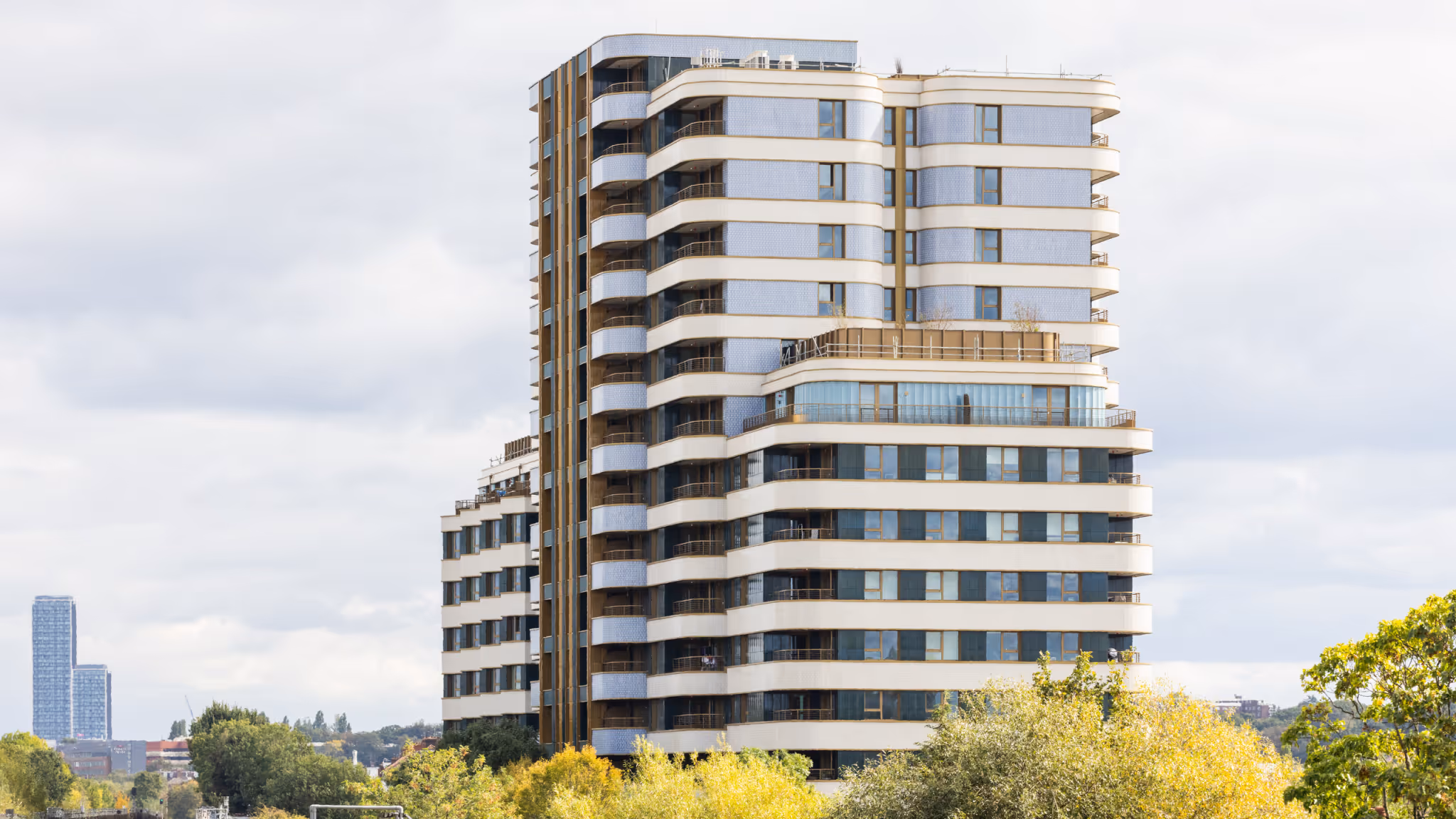
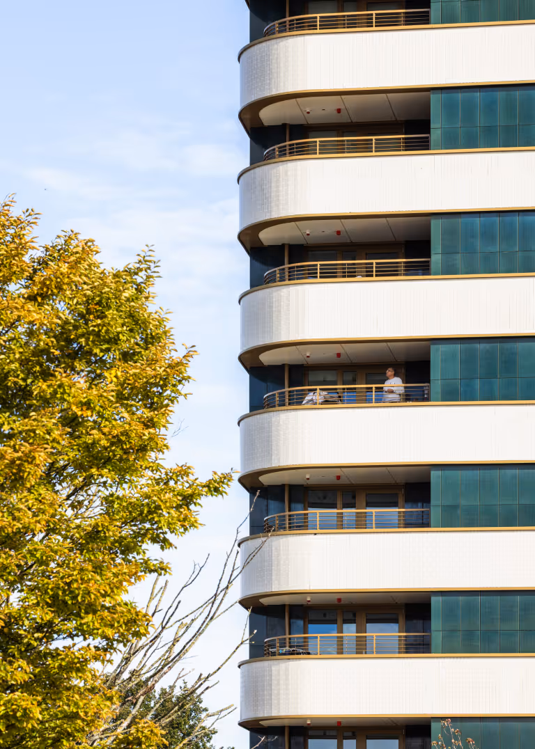
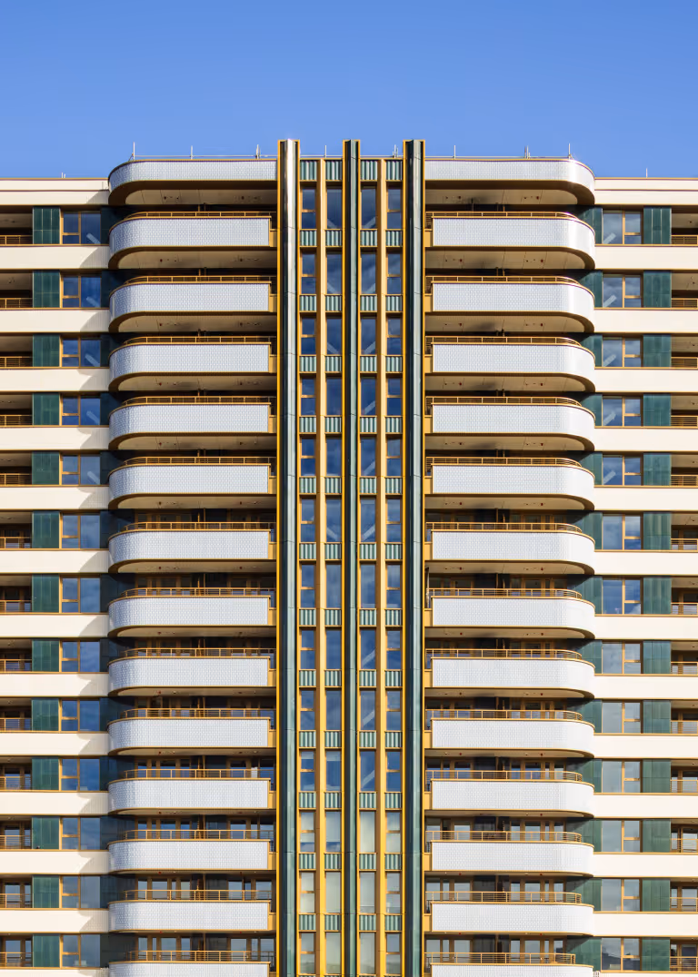
The Wiltern is a Build to Rent development of 278 homes that takes inspiration from the principles of Art Deco architecture, applied through a contemporary and rational design approach. Located adjacent to the Grade II* listed Hoover Building, the scheme responds to this context in its proportion, geometry, and material strategy, rather than through direct replication. The Hoover Building, designed in 1932 by Wallis, Gilbert & Partners, served as the UK headquarters and factory for Hoover. A landmark of industrial Art Deco, it is characterised by its steel-reinforced concrete frame, white Snowcrete render, bold horizontal emphasis, and decorative detailing influenced by the Egyptian Revival style. Set along the A40, its symmetrical frontage and polychromatic finish created a strong visual identity at speed. Following closure in the 1980s, the site was partly redeveloped, with Tesco constructing a supermarket to the rear and the main building later converted to residential. Many of those apartments are single-aspect and north-facing, issues directly addressed in the design of The Wiltern.
The Wiltern
The Wiltern
No items found.

The Wiltern’s curved façades are formed by repeating radiused balconies, made from standardised components that deliver formal complexity with construction efficiency. While the exterior form appears fluid, the internal layouts are orthogonal and symmetrical, balancing expressive massing with practical planning. The building is designed on all sides, with no secondary elevation. Each façade is context-specific: angular bays face the railway; the main entrance is marked by vertical green terracotta fins and a recessed, glazed lobby beneath a projecting canopy clad in green ceramic tiles. A carefully defined palette, white brick slips, bottle-green glazed terracotta, and gold-toned metalwork, adds depth, durability, and consistency. These materials reference the Hoover Building’s visual language without replication. Used in horizontal bands, they reinforce a base – middle – top composition and reflect the internal organisation on the exterior. Several colour schemes were tested during the design development stage; the final palette was selected to enhance articulation and reduce visual mass through balanced contrast and reflectivity. The design also draws on nearby architectural references, including the orthogonal geometries and palm motifs of Teignmouth Parade, and the residential scale, brickwork, and detailing found within the Brentham Garden Suburb Conservation Area.
The Wiltern
The Wiltern
The Wiltern
No items found.

The internal plan is symmetrical, centred on a single core, with stepped wings that reduce overshadowing and improve daylight for neighbouring homes. The massing increases the proportion of dual-aspect apartments and reduces reliance on north-facing layouts. Along the railway-facing elevation, internal triangular bay windows replace balconies to provide amenity space while enhancing sound insulation and articulation, drawing inspiration from the geometry of the Hoover canteen façade. Amenity spaces are integrated into the architectural massing, not applied separately. Ground-level communal areas open directly onto landscaped gardens, while upper-level lounges and terraces are positioned to make the most of long views across West London.
No items found.