Wayfinding & Place Identity

3 & 15 West Lane

Wayfinding at 3 and 15 West Lane was conceived as a counterpoint to the expressive interiors, grounded in the project’s industrial, warehouse-inspired architecture. The visual language draws from early 20th-century American warehouse signage, particularly the stacked, utilitarian typography of New York’s garment district. This motif provides a unifying design thread throughout both buildings, supporting a coherent identity and intuitive navigation.
3 & 15 West Lane
3 & 15 West Lane
3 & 15 West Lane
No items found.

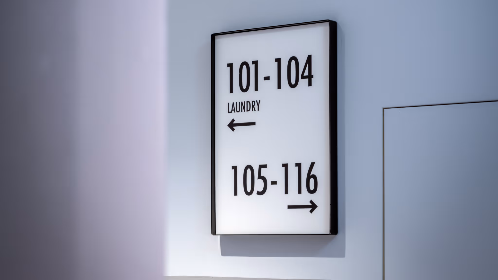
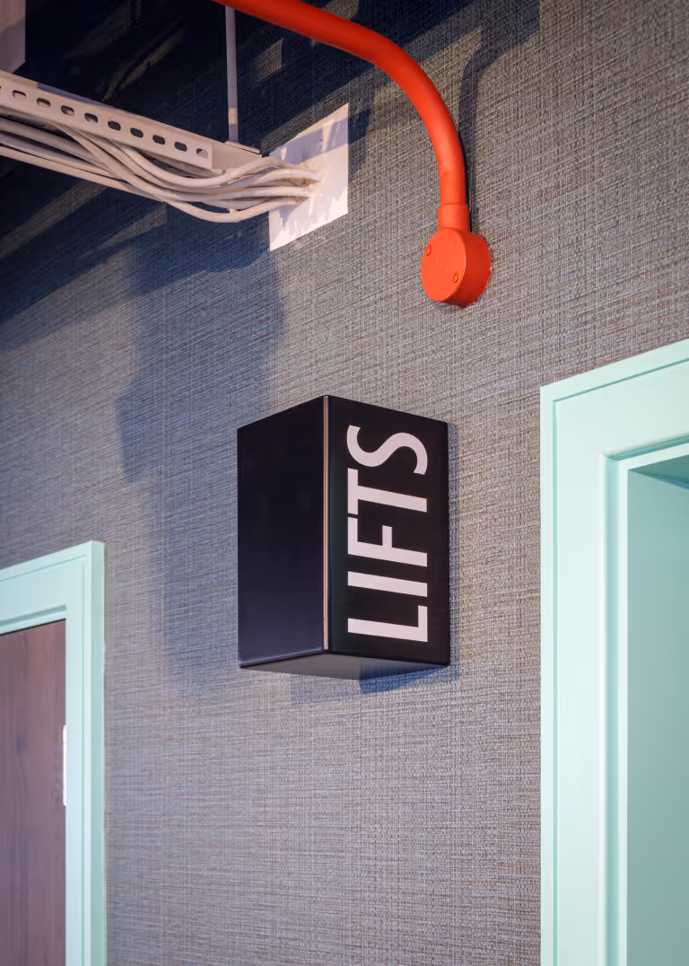
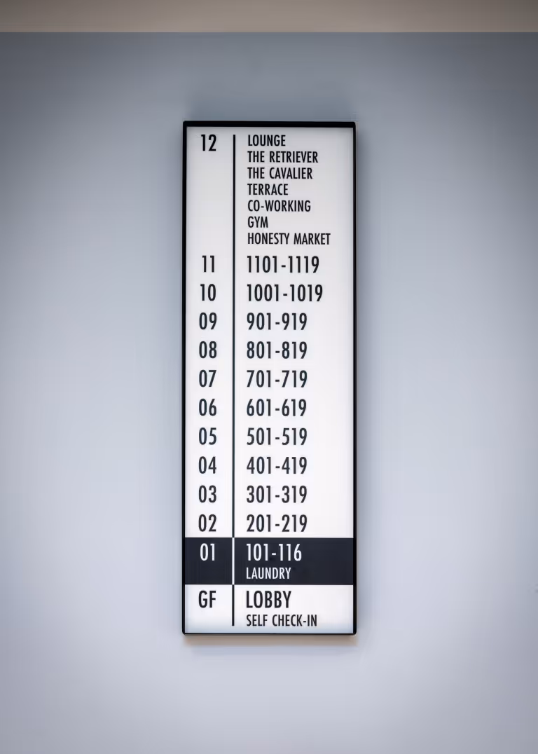
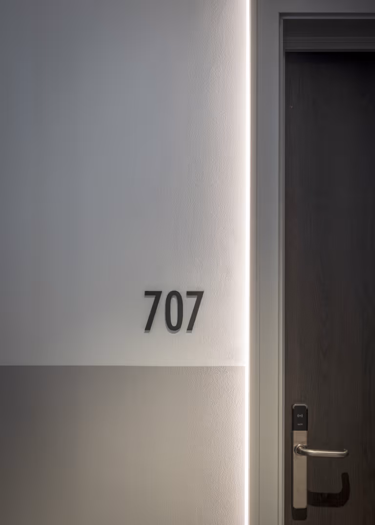
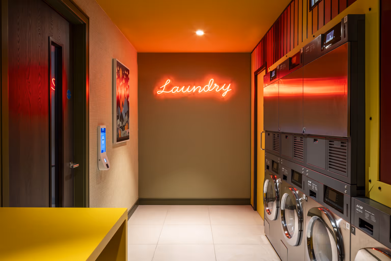
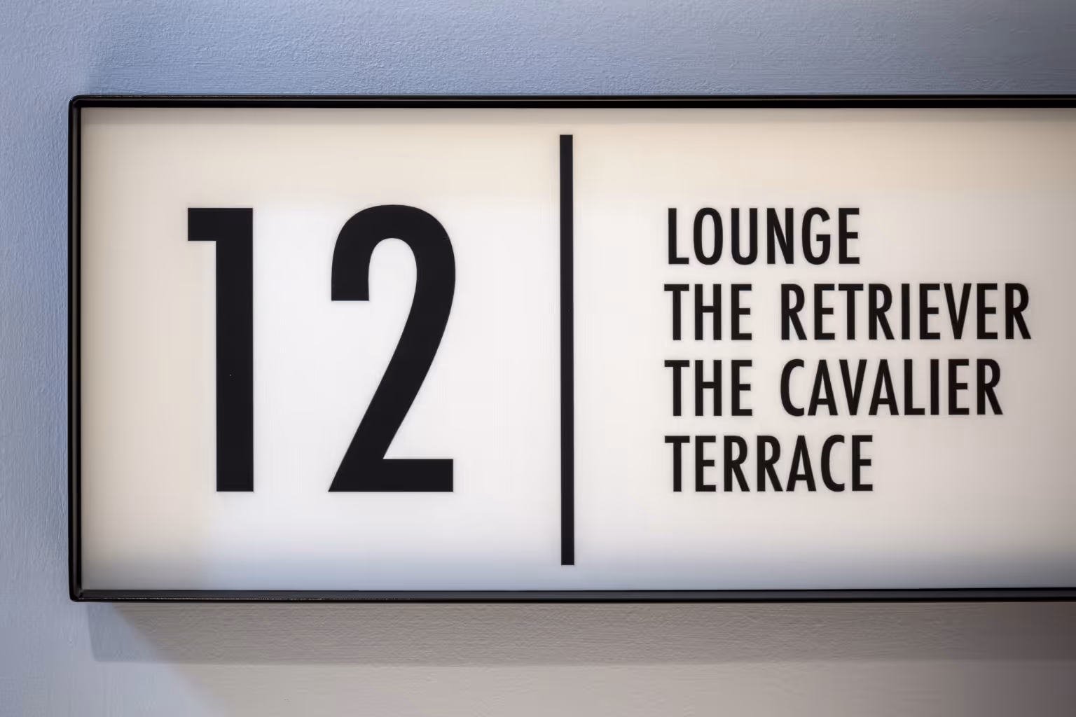
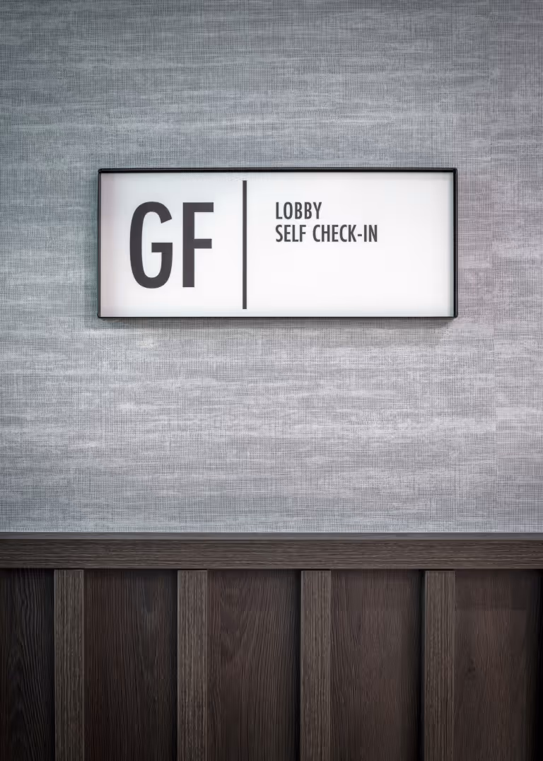
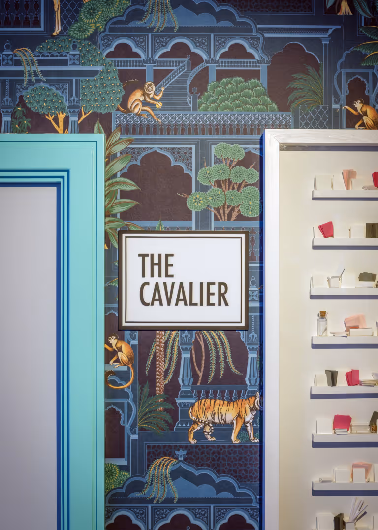
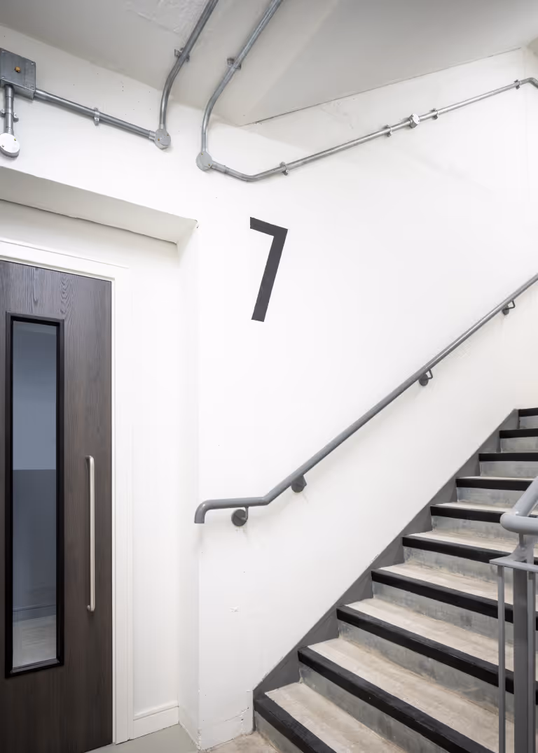
Each element, apartment numbers, directories, floor signage, has been designed to reinforce clarity and rhythm. The system uses black-and-white lettering housed in bronze-finished metal trays, mounted flush within architectural wall finishes. Typography, materials and scale are tuned to each location: corridors feature clear, bold signs; floor numbers are presented as supergraphics in lift lobbies; and ground floor directories are backlit for high visibility.
3 & 15 West Lane
3 & 15 West Lane
No items found.

Beyond its functional role, wayfinding is also used to create moments of delight. Neon signs for utility spaces, mirrored plaques, and playful text treatments add character. These touches are carefully integrated into the finishes and lighting strategy, ensuring they feel embedded rather than applied. Together, they lend a sense of charm and informality to an otherwise highly structured environment.
3 & 15 West Lane
3 & 15 West Lane
3 & 15 West Lane
No items found.